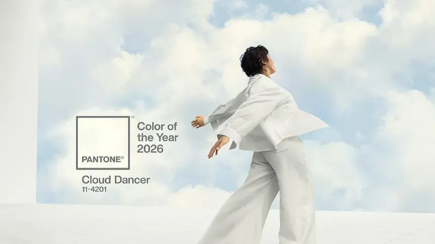
Pantone’s 2026 Color of the Year, Cloud Dancer, sparked a lot of conversation in the design world—and the reactions were far from subtle. While the intention behind the hue is clear—purity, simplicity, and a clean slate—many web and branding designers felt it was yet another nod to an already dominant aesthetic: neutral minimalism.
And as someone who works in web and logo design, I understand both sides.
For the past several years, the digital landscape has been drenched in neutrals. Scroll through modern websites and you’ll see the same palette repeated again and again: whites, creams, sand tones, muted greys. Logos followed suit, favoring clean typography and soft colorways in the name of “professional” and “elevated.”
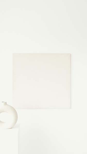
Photo by Artem Podrez
There’s a reason it took hold.
- Neutrals perform well online:
- They’re accessible and legible
- They create calm and spacious layouts
- They allow imagery and content to breathe
- They rarely clash or overwhelm a brand
A neutral-dominant website feels orderly and serene—qualities users subconsciously trust.
And for logos, neutrals offer timelessness and versatility, adapting effortlessly across platforms and products.
But here’s where the backlash reveals something important:
We’re hitting a collective saturation point.
Designers and business owners are starting to crave more individuality. Brands want to stand out—not just fit in. And users are becoming more responsive to visual personalities that break from sameness.
This doesn’t mean neutrals are disappearing. Far from it.
Neutrals will always be foundational in web design because they…
- ground the layout
- support readability
- elevate whitespace
- frame the user’s focus
But—it’s time to talk about contrast.
How Accent Colors Can Elevate Calls to Action and Content
A well-placed bold or bright color can:
- draw attention to CTA buttons
- highlight key messaging
- distinguish brand identity
- create emotional resonance
Think of neutrals as the canvas and bold colors as the brushstroke that brings the artwork to life.
Cloud Dancer may not be the vibrant hue many expected, but perhaps it reflects the true moment we’re in:
a transition from monochrome minimalism
toward purposeful, strategic color
Not chaos.
Not overwhelm.
But intention.
What This Means for Designers in 2026 and Beyond
Logo designers can take this shift further—infusing subtle neutrals with pops of personality. Web designers can use impactful accent colors to lead the eye and elevate the user experience.
The takeaway?
Neutrals still matter.
But personality matters too.
And the brands that will stand out in 2026 won’t be the loudest…
but the most intentional.
Whether you embrace Cloud Dancer as a foundation or a contrast, it invites a necessary question:
How can color elevate—not just decorate—your brand?