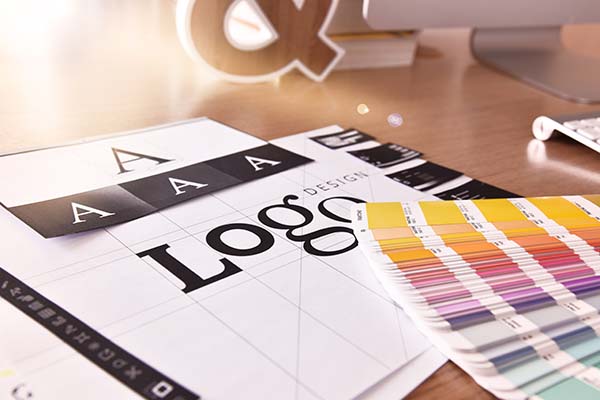
Your logo is more than just a pretty graphic—it’s the face of your brand. It’s the first thing people see and one of the most lasting impressions they’ll remember. But too often, businesses fall into common logo design pitfalls that can confuse customers, dilute brand identity, or look unprofessional.
Here are some of the most common logo design mistakes to avoid—and how to get your branding on the right track:
1. Overcomplicating the Design
Simplicity is key when it comes to logos. A cluttered or overly detailed logo may not scale well on smaller screens, look clear in black-and-white formats, or be easily recognizable at a glance.
Avoid this by:
-
Sticking to clean, minimal elements
-
Designing for scalability and versatility
-
Choosing one strong concept, not five competing ideas
2. Using Generic or Overused Symbols
It’s tempting to grab a free icon or use common imagery (like lightbulbs for ideas or globes for global services), but this can make your brand blend in—not stand out.
Avoid this by:
-
Creating a custom concept that reflects your unique brand personality
-
Steering clear of clichés and template-style logos
-
Working with a designer to develop original visuals
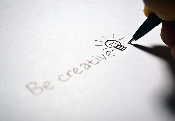
(Yes, I used a lightbulb. Let’s talk about that…) We all know—lightbulbs are the cliché symbol for ideas. And yet, here it is again, glowing proudly. That’s the point. Overused imagery like this has become so instinctual that even designers reach for it out of habit. The irony? Using a lightbulb while telling you not to is exactly why we need to rethink our visual choices. The takeaway: Think beyond the obvious. Your designs should illuminate your brand uniquely—not just plug into what everyone else is doing.
3. Poor Font Choices
Your font says a lot about your business. Using trendy or hard-to-read fonts can hurt your logo’s professionalism and longevity.
Avoid this by:
-
Choosing timeless, legible fonts
-
Avoiding more than two font styles in one logo
-
Making sure the font reflects your brand’s tone (playful, elegant, modern, etc.)
4. Ignoring Color Psychology
Colors evoke emotions and send subconscious messages. Choosing colors without strategy can create mixed signals about your brand.
Avoid this by:
-
Learning the basics of color psychology
-
Sticking to a consistent palette across your branding
-
Ensuring good contrast and visibility on all backgrounds
5. Following Trends Too Closely
While it’s good to be aware of current design trends, building your logo around them can date your brand quickly.
Avoid this by:
-
Focusing on timeless design principles
-
Incorporating subtle trend elements (if at all)
-
Prioritizing what works for your brand, not what’s popular
6. Failing to Think About Versatility
Your logo should look good everywhere—on business cards, social media, packaging, embroidery, or a billboard. Designing something that only works in one format limits your flexibility.
Avoid this by:
-
Creating versions of your logo (full, icon-only, black/white)
-
Testing the design in different sizes and uses
-
Ensuring it works well in both color and grayscale
7. Skipping the Strategy
A logo isn’t just visual—it’s strategic. Designing without a clear brand identity, mission, or audience in mind leads to inconsistent branding.
Avoid this by:
-
Developing a brand strategy before the design process
-
Understanding your audience and values
-
Using your logo to tell your brand story, not just look “cool”
Final Thoughts on Logo Design Mistakes to Avoid
A great logo builds recognition, trust, and connection. Avoiding these common mistakes can help you craft a brand identity that lasts and works hard for your business.
Need help creating a strategic, professional logo?
Let’s work together to design something that truly represents your brand and its future.