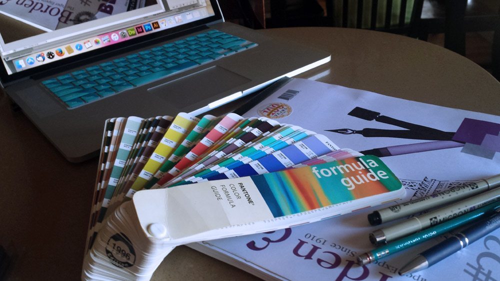
When I speak to clients about current design trends they sometimes get a worried look. I’ve figured out why and do my best to explain what exactly I mean. Trends are often confused with fads. I’m not talking about fads in this post. Trends are the directions an element of design is heading in. Knowing what styles are trending and what works well not only benefits the client but the designer, too. It helps my work stay up-to-date and relevant. Logos enable brands tell their stories in a direct and visual way. The manner in which this is done is ever-changing. In this post I’ll cover a few 2016 logo design trends.
2016 Logo Design Trends
 Negative Space
What’s typically unused white space is incorporated into a logo as a “subliminal message.” It’s a great way to capture a customer’s attention, and make them think twice. This logo design trend isn’t completely new, the FedEx logo is a great example of negative space that’s been around for awhile. Once you see the “hidden” arrow, you always see it (hint: it’s between the capital “e” and the letter “x”). The arrow implies speed, a destination in a very subtle way.
The Girl Scouts logo is another excellent example of the negative space logo design trend. The lack of detail creates a minimalistic design that still conveys diversity of the organization.
This design trend goes back to the idea of less is more. Here’s a link to many more successful examples of negative space design.
 Hand-Drawn
The appeal of hand-drawn typefaces and logos has not disappeared in the digital age. In fact, it’s as strong as ever. This design trend evokes a more personal feel and is a fit for companies that prefer to use a lighter approach when it comes to branding. Done well, it communicates a more intimate, softer connection with its target audience.
This design approach isn’t for every business. It’s more important to have a logo that accurately reflects your company rather than follow a trend. You can view more examples here.
 Flat
Flat
During the previous decade, complex gradients, shadows, bevels, feathered effect, 3-D logos were trending. In flat design the main attention instead goes to typography and minimalistic elements. Many companies went away from their more complicated design to simplified designs that portray their brands in a clean, minimal way.
Nivea in the example above shows the trend of moving away from a more complex design to one that has no shadows or depth. The logotype remained the same, yet the design looks refreshed and more modern by eliminating the gradient.
This simplicity in this logo design trend allows these types of logos to scale well, making them compatible with numerous browsers and mobile devices. From a designer’s perspective it’s vital to remember how businesses use logos in the digital era during the design process. Social media and other digital channels have changed how customers are reached. Along with staying aware of 2016 logo design trends it’s an important factor to keep in mind.

