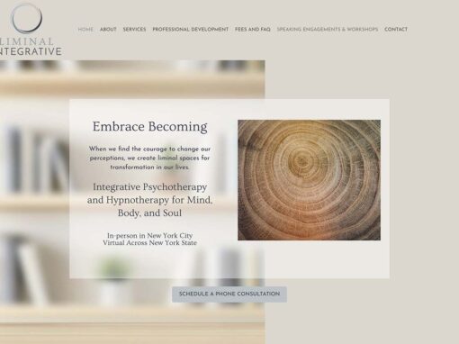
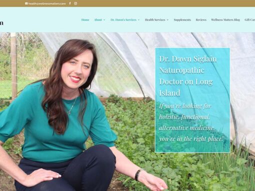
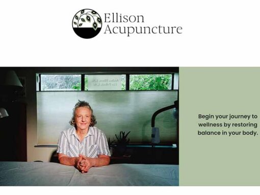
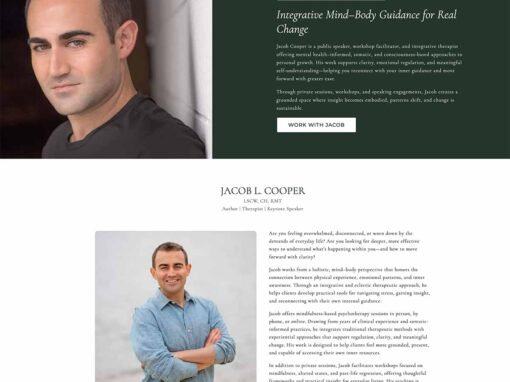
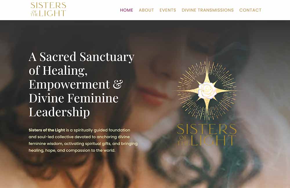
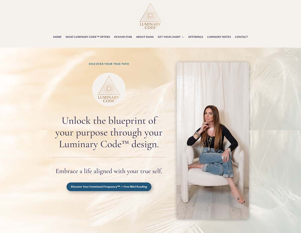
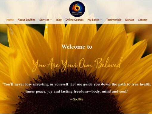
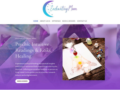
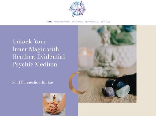
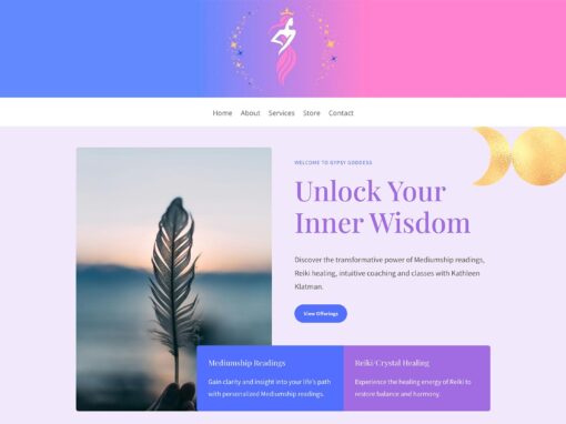
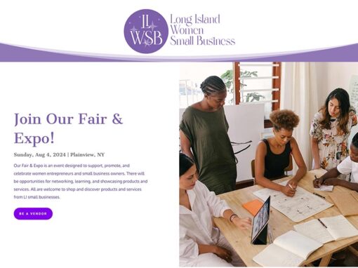
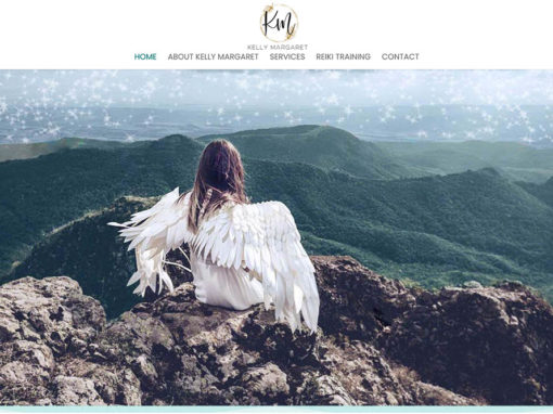
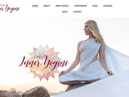
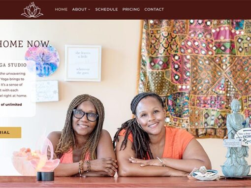
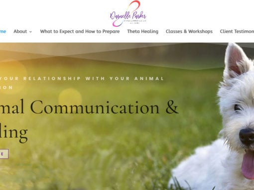
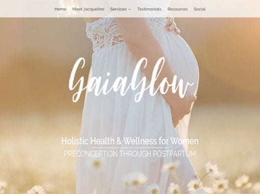
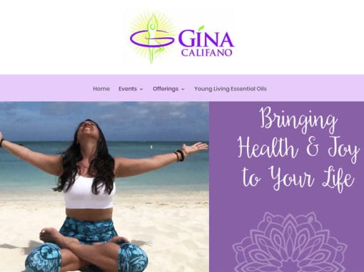
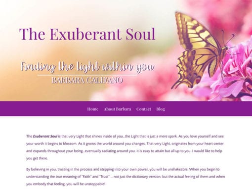
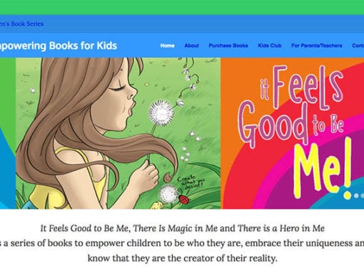
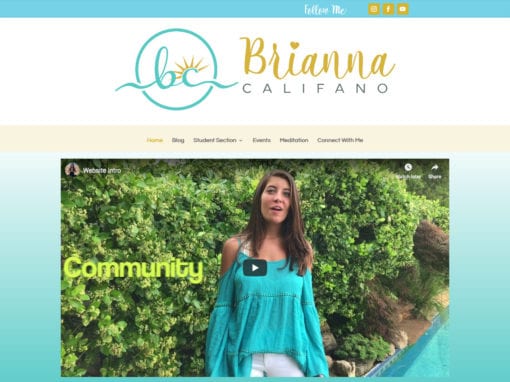
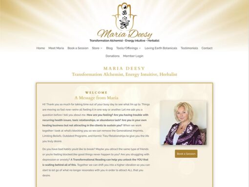
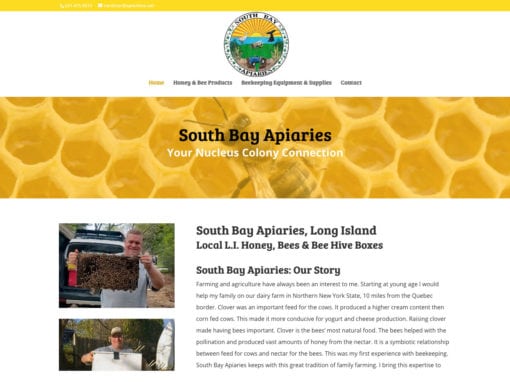
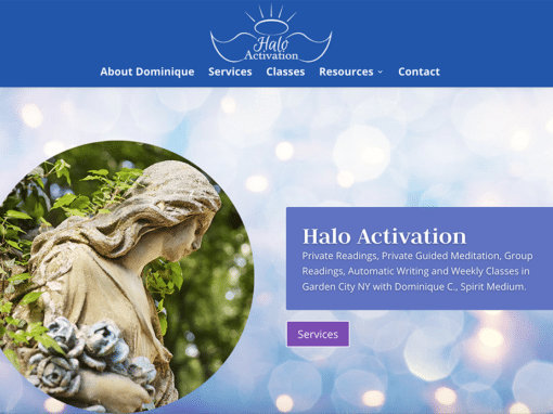
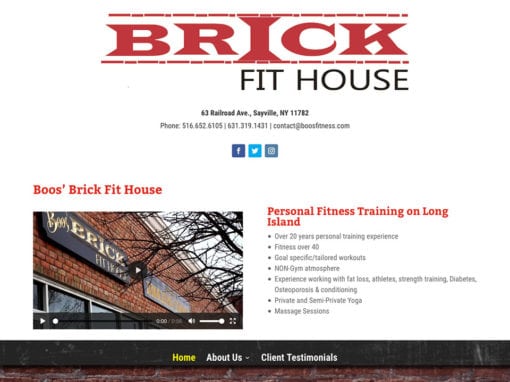
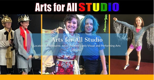
Website & Logo Design
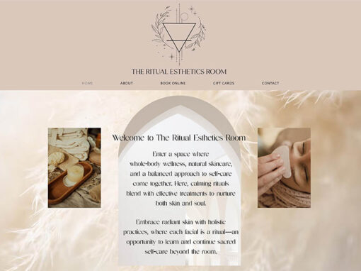
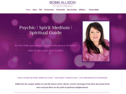
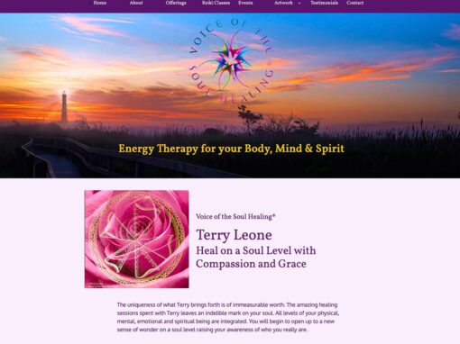
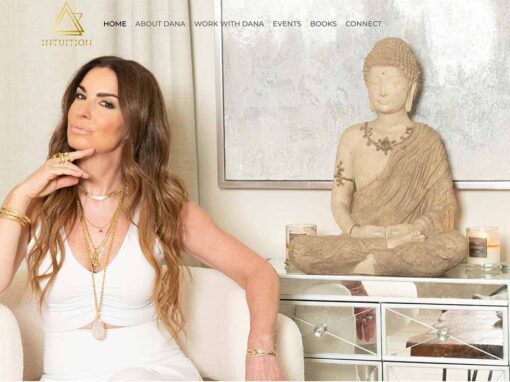
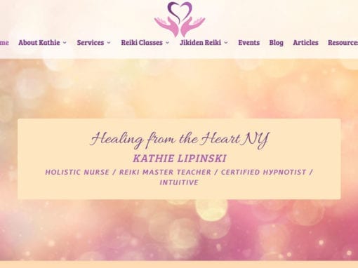
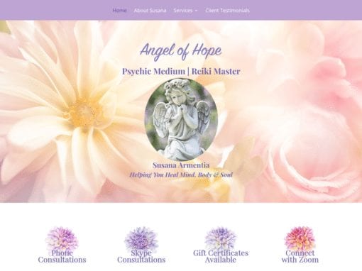
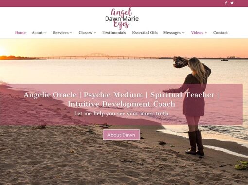
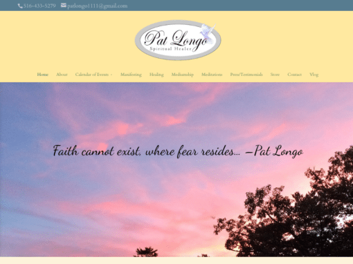
Tri-Reiki with Sharon


Tri-Reiki with Sharon
“Good vibes” and healing energy
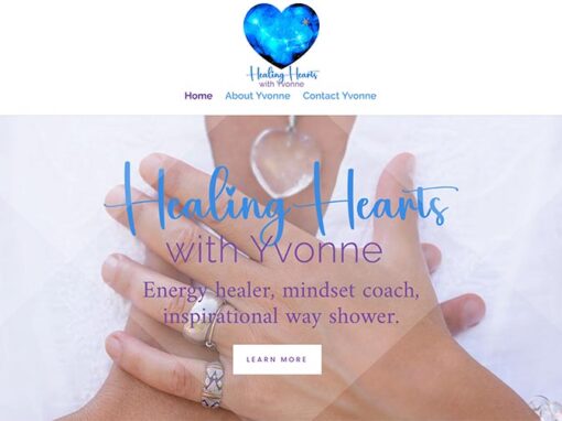
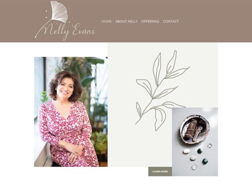
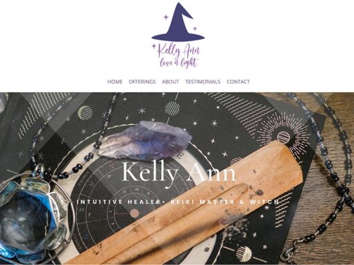
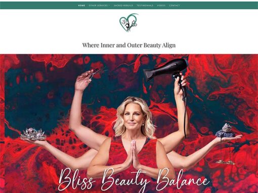
A logo and website design for a Long Island-based Reiki practitioner who had recently launched her business. Since this was a new enterprise, branding was needed to establish a strong identity. After speaking with the client to get a better understanding of what she wanted her logo to convey, a stylized lotus with three petals was created reinforcing the idea of three or tri. (Using “tri” in her business name also plays on the word “try” as in “try Reiki with Sharon”). The logo design helped with the overall look of the website. A closeup image of a flower petal makes up the homepage’s background, that compliments the color scheme used throughout the site creating a soft and welcoming feel. Soft gradients are used to break up sections creating a clear, but subtle, separation and ultimately contributing to a successful user experience. A consistent layout is used throughout the pages with titles, subtitles and paragraph text all retaining the same colors and fonts. Using mostly images provided by the client, the result is a very personal design that resonates not only with the client but allows visitors to experience a deeper connection with her as well.
View My Work!