Website Design
With Love & Light
With Love & Light
Making a store website shine
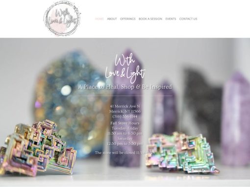
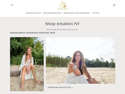
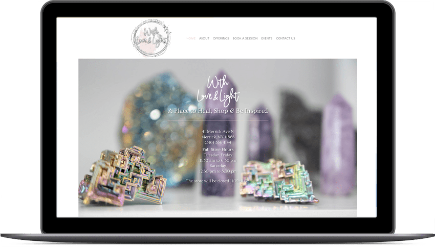
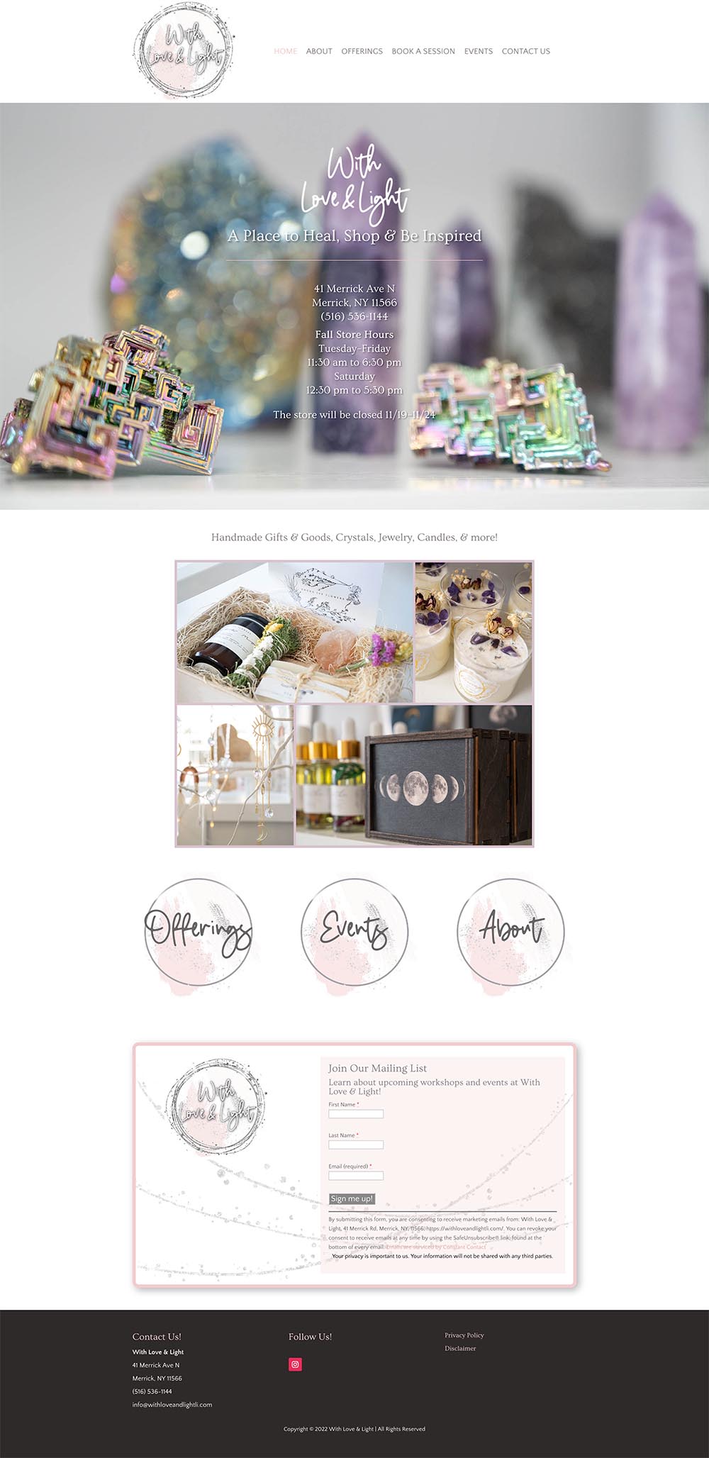
When the client came to me, she was unhappy with her current website. I provided a website review where I outlined the areas of the site that needed to be addressed. Mainly, it didn’t look like a website for a store. There were no images of any of the products or the store itself that would communicate that right away. People spend a few seconds on a website before they click away, therefore it is vital that you make an impression in that limited time. It was a one-page website which in some cases is the appropriate solution. However, since events are held at the store as well as Reiki and makeup sessions, a multi-page site was a better fit. I proposed expanding the site, enabling online booking, creating an event calendar and adding images. As it turned out, the client had a lot of the same ideas and was very excited to get started.
Fortunately, she had some wonderful professional photos that highlighted the curated products found in the store. Her inventory changes often therefore it was great that the photos were general in nature. Her healing room and makeup area were also photographed allowing the spaces in the store to be featured as well. There was no mistaking that the website was for a store.
The new look of the website inspired the client to ask me to come up with a new logo design. The old logo was on a black background which meant that there had to be areas of black on the site and other promotional materials. The use of white space and touches of pink from the site was carried over from the website. I kept the same handwritten font, added some sparkle because you can never have too much.
View My Work!
